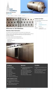
Tait Stainless do stainless steel fabrication and the owner wanted a small efficient site to showcase their products to potential customers and gain more business.
This site was fairly straight forward to set up. One thing I had to be careful of was to get all of the engineering descriptions correct, especially when captioning the images. Errors are not a good look when you are trying to convey your expertise.

This site was fairly straight forward to set up. One thing I had to be careful of was to get all of the engineering descriptions correct, especially when captioning the images. Errors are not a good look when you are trying to convey your expertise.
Logo Design
The logo was designed based on an idea from the client. The building to the left of the logo is based on the famous Chrysler Building in New York. The text is meant to be brushed aluminum and the blue was inspired by the blue tint used when marking out metal from my telecommunications apprenticeship days.
Product Photos

The client supplied a number of photos of products that the business had built, but for all of the images the product could barely be seen due to the busy background.
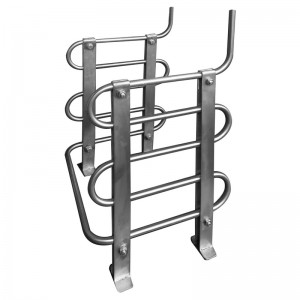
Using a photo editing application I carefully pruned away the background, mainly using the pen tool to select the area and then deleting it.
From the image it can be seen the result is quite pleasing and the products are clear to see now. With some images I tried a drop shadow but I'm not sure if I like the effect. If the shape is simple and the edges blend with the background it works but for complex shapes like the stainless steel cooler to the left a drop shadow would look messy.
The Result
You can check out the final result at http://taitstainless.com.au.
